Artsy Editor Tested Different Variations and Increased CTR to Their Pricing Page
About Artsy Editor
Artsy Editor is a premium WordPress WYSIWYG editor made for bloggers and developers. It provides faster ways to format, add links, upload media, and scale images so that you can focus on writing the best content. Hundreds of writers rely on Artsy Editor every day.
For their A/B testing (WordPress application), they chose VWO.
Goals
Their hypothesis was that people want to see strong call-to-actions to try out demo and learn about our pricing before actually committing to purchase the product. The goal of their home page was to route more people to their demo and pricing page.
Their home page consisted of a call to action sandwiched between a headline and some screenshots of the editor.
They decided to A/B test this area on the home page and used VWO for the same.
Tests run
The Artsy Editor team tested whether a single button can concentrate more clicks or having 2 buttons with different contrast can give people more options to click. They also tested different phrases used in the buttons (revealing the price, mentioning the demo, and others).
They A/B tested 3 different button combinations:
- Try Demo & Buy Now for $19.99
- Try Demo for Free
- Try Demo for Free & Buy Now
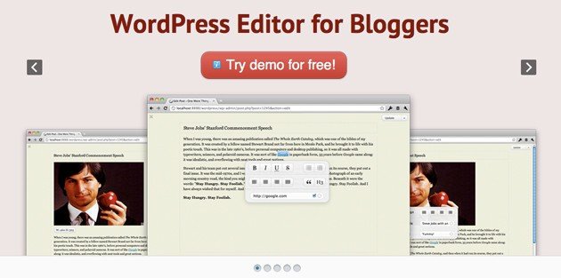
Variation 1 with a single demo button had a 5% improvement in click-through to their demo and 47% improvement in the click-through to their pricing page.
The surprising result here is that even though there wasn’t any Buy Now button, the Try Demo button (indirectly) improved conversions to the pricing page by 47%.
Here’s how variation #1 looked like:

Variation #1: 47% increase in clickthroughs
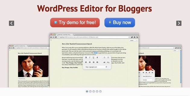
Their variation #2 with 2 buttons (with the emphasis on demo button) had a 7% improvement in click-through to demo and 17% improvement in click-through to the pricing page.

Variation #2: 17% increase in clickthroughs
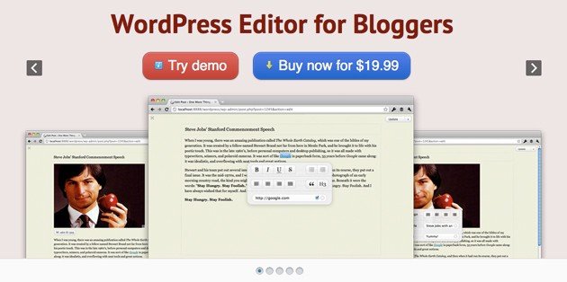
Variation #3 had 2 buttons with the price written on the Buy Now button. Surprisingly, this variation had no real improvement in conversions.

Variation #3: No improvement in click-throughs
Conclusion
When we asked Artsy Editor about their biggest lesson learned from this A/B test, here is what they said:
“One big lesson learned: for software product like us, the primary call-to-action should be the demo/trial, not the checkout/purchase. Because most of the visitors are first-time visitors and they want to focus on learning more about the product before making a purchase decision. If you push too hard at the beginning, they might feel distracted, uncomfortable and leave the site.“
Regarding the tool they used, here is what they had to say:
“We wouldn’t do anything similar without VWO. Both creating the test and checking results are done in few clicks.“
Artsy Editor said they would continue to test other pages and elements as well, especially the pricing and checkout pages. If you sell software online, make sure you also A/B test your call to action buttons.
It can have a dramatic impact on your sales and conversions, just like it did for Artsy Editor.

Location
Castro Valley, CA (US)
Industry
Software
Experiment goals
Increase in CTR
Impact
47% increase in Click-through rate


